Mobile Shoppers Not Converting: Designing Shopify Product Pages for Small Screens
Understand why 'responsive' isn't enough for mobile product pages and how to design for conversions with targeted visuals and clear calls to action.
The GENCY lite Team
Sep 4, 2026 · 5 min read
Why Responsive Design Alone Isn't Enough
You've checked your analytics and seen the trend: most of your storefront traffic is coming from mobile devices. Yet, despite having a 'responsive' Shopify theme, your mobile conversion rates aren't where you want them to be. A responsive theme is the foundation, not the finish line: adapting a layout to a smaller screen is not the same as planning the page around that screen.
When a desktop layout is only adapted rather than rethought, the same page can end up asking a phone shopper for more work: text that is small, key details pushed far down, images that lose their impact at thumbnail size. Mobile shoppers swipe more, scroll faster, and expect an immediate answer. Key selling points and specifications can end up buried where a phone shopper will never scroll. Conversion has many inputs — price, shipping, trust, page speed, traffic quality — but this gap between what a phone shopper expects and what an adapted desktop layout delivers is one factor that can contribute to lower conversions.
See It, Believe It: Photography That Replaces Touch
On a desktop, a shopper might click through several images or even open new tabs. On mobile, every tap and load time matters. Since shoppers can't physically touch or inspect your product, high-quality, comprehensive imagery becomes their primary way to evaluate it. This is where many mobile pages fall short, relying on a single hero shot when a more thorough visual story is needed.
To bridge the gap between digital viewing and physical inspection, your product photography needs to be intentional:
- Multiple Angles: Show the product from all relevant sides. Don't make shoppers guess what the back or bottom looks like.
- Detail Shots: Highlight texture, stitching, closures, unique design elements, or key components. These close-ups convey quality and build trust.
- In-Context Shots: Show the product being used or worn. This helps shoppers visualize themselves with the product.
More imagery shouldn't mean a heavier page. Compress what you upload, serve appropriately sized formats, and lazy-load anything below the first screen — on a phone, an image that arrives late is an image the shopper never saw.
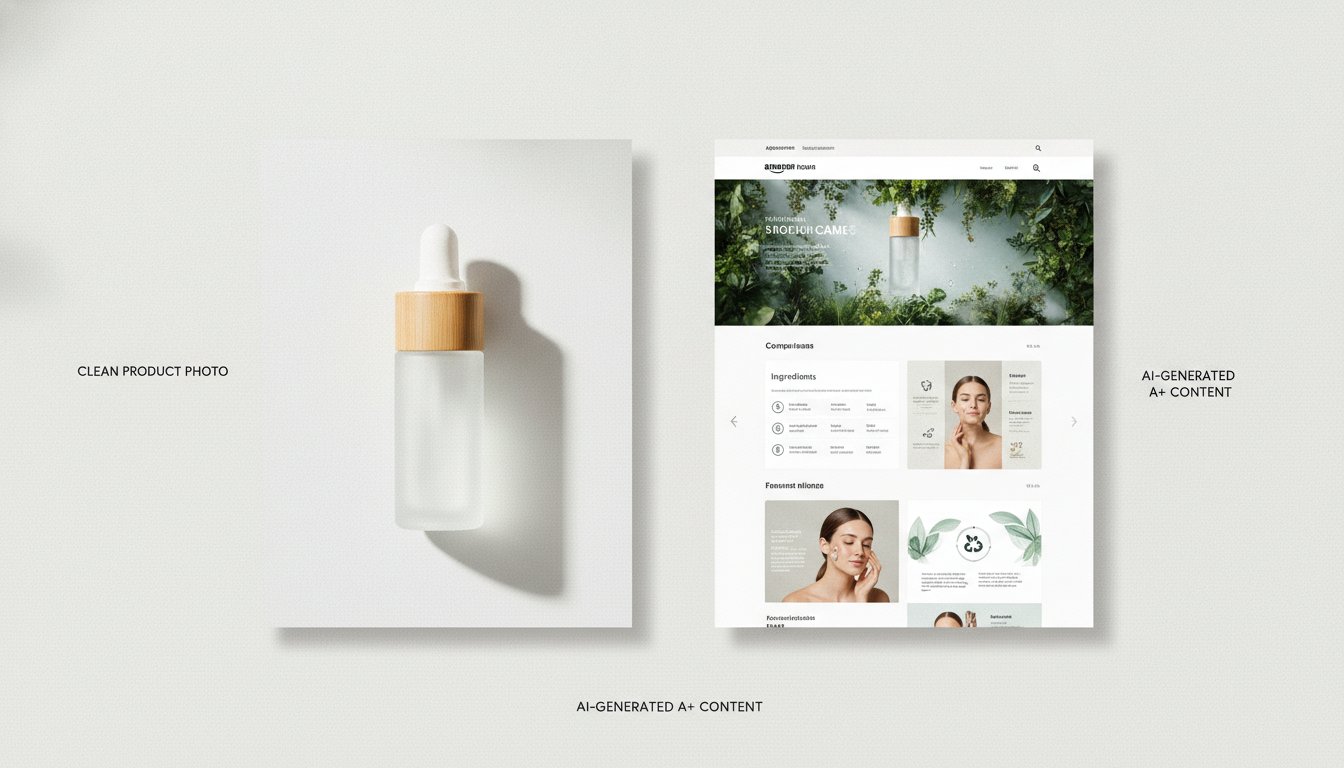
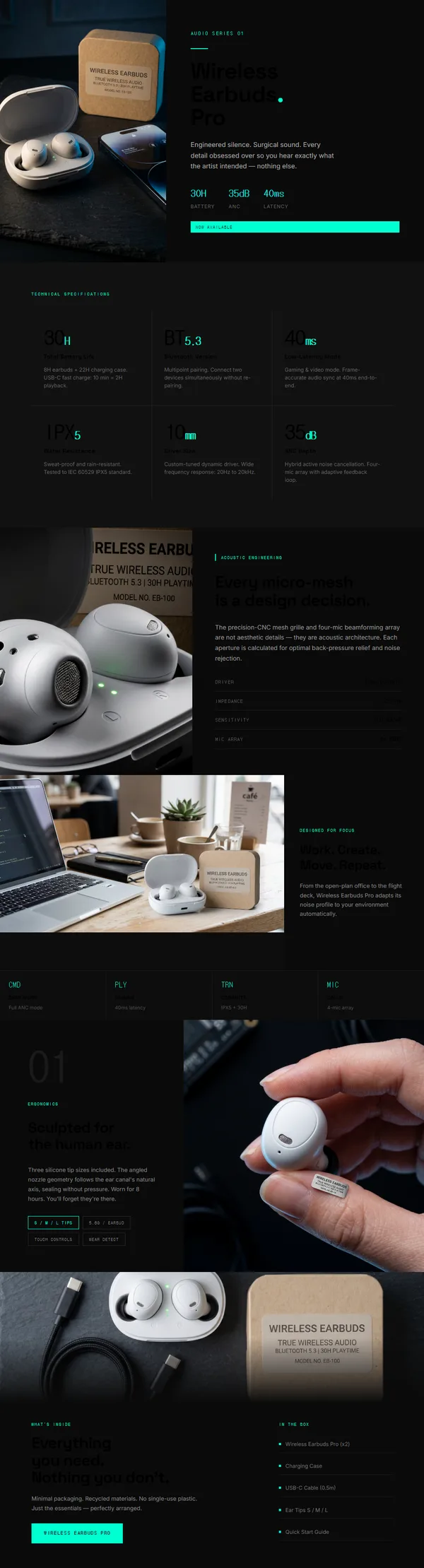
Creating this array of visual assets can be resource-intensive. GENCY lite helps turn a single product photo into a range of visual assets for a product detail page: it generates additional product visuals and lifestyle scenes rather than photographing them again. Those visuals are generated, not a reconstruction of the physical item, so keep using real photography where a shopper needs to see the exact object. Category presets cover more than 50 product categories, from apparel and shoes to skincare, food, electronics, home, kids, sports and pet.
Answering Objections, Not Listing Features
Many product pages mistakenly focus on listing every feature. While features are important, mobile shoppers are primarily looking for solutions to their problems or answers to their immediate concerns. Your page has to anticipate and answer the objection the shopper actually has, not just present a dry specification sheet.
For example, if you sell a piece of furniture, a shopper on a small screen might immediately wonder, 'Will it fit in my space?' or 'Is it comfortable?' rather than prioritizing the exact type of wood. Your copy and visuals should directly address these concerns.
- Prioritize Answers: Identify the most common questions shoppers have about your product. Make sure the answers are immediately visible or easily accessible without extensive scrolling.
- Concise Copy: Mobile screens have limited space. Break down long paragraphs into short, punchy sentences. Use bullet points for readability. Every word should add value.
- Visual Storytelling: Integrate text with images. Use captions or annotations on your product photos to answer specific questions or highlight benefits in context. This reduces the cognitive load on the shopper and delivers information quickly.
By framing your content around answering objections, you create a more persuasive and conversion-friendly experience for mobile users.
Clear Paths to Purchase: Variants and Calls to Action
Once a mobile shopper is interested, the path to purchase must be frictionless. Any confusion or uncertainty can lead to abandonment. Two critical areas where mobile pages often falter are variant selection and calls to action (CTAs).
Variant Image Swapping: When a shopper selects a color, size, or style variant, the main product image should immediately update to reflect that selection. This visual confirmation is crucial. It reassures the shopper they have chosen the correct item and are adding the right product to their cart. Without this immediate visual feedback, doubt can creep in, leading to hesitation or a bounce.
Plain CTAs: Resist the urge to use clever or overly branded calls to action. On a small screen, clarity triumphs over creativity. 'Add to Cart' or 'Buy Now' are familiar, immediately understandable labels. They leave little room for misinterpretation. Ensure your CTA buttons are prominent, easy to tap, and consistently visible, even as the user scrolls. A clear, direct instruction reduces friction and guides the shopper confidently towards completing their purchase.
Iterate and Optimize: Continuous Improvement for Mobile
Optimizing for mobile is an ongoing process, not a one-time fix. Once you've implemented changes, it's crucial to measure their impact. When testing new layouts, images, or copy on your Shopify product pages, focus on one primary Key Performance Indicator (KPI), such as your mobile conversion rate. This allows you to clearly understand the effect of your changes without getting lost in too many metrics.
Additionally, establish guardrail metrics, like average order value or return rate, to ensure that improvements in one area aren't negatively impacting others. Don't try to track five metrics at once; a focused approach yields clearer insights.